|
Note: The screenshots may not be a true representation of the current release and may have changed slightly due to added functionality or refinements.
 The toolbar widget is a rewrite of the gtk supplied toolbar, which adds the following extra functionality.
- Resizable toolbars (when docked against other toolbars).
- Resizable floating toolbars.
- The ability to hide buttons on a toolbar.
- ALT customisable toolbars for dragging buttons between menus and toolbars.
- Sub menus that can be torn off.
- Toolbars and Menus that keep a history and initially hide low usage count buttons.
- An image editor for customising the toolbarbutton appearance.
- The ability to drag toolbarbuttons from the customisation dialog (or via ALT) between menus and toolbars.
- Toolbars can be docked against the vertical or horizontal orientation.
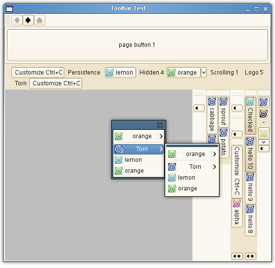
This displays a popup menu that has been torn from a parent toolbarbutton. A menu button is open showing a nested popup menu. The same toolbarbutton can exist in multiple menus and in multiple toolbars.

This shows each page of the standard customisation dialog for the curlyankles library.
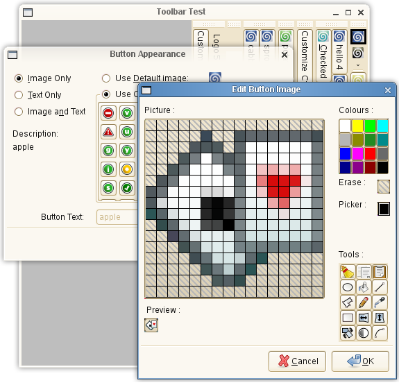
This displays the image editor for customising toolbarbuttons. The editor has the ability to rotate, mirror, invert, draw polygons, draw lines, draw ovals, fill colours and to colour pick existing colours to the pallette.
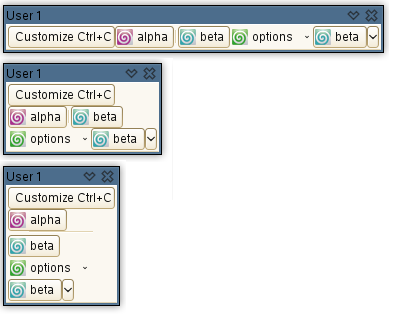 This displays a floating toolbar. Normally floating toolbars in GTK are always horizontal and can be quite long depending on the amount of contained buttons. They cannot be resized or wrapped. This is the same floating toolbar, but this time wrapped. It is achieved by grabbing the edge of the floating toolbar and resizing it. This displays a floating toolbar. Normally floating toolbars in GTK are always horizontal and can be quite long depending on the amount of contained buttons. They cannot be resized or wrapped. This is the same floating toolbar, but this time wrapped. It is achieved by grabbing the edge of the floating toolbar and resizing it.
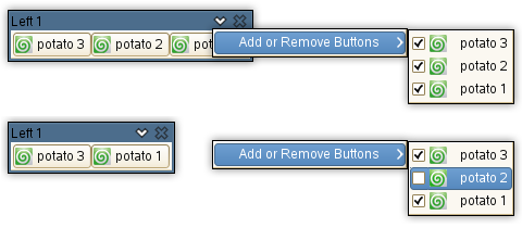
This displays the customise menu which allows individual toolbarbuttons to be hidden or shown, reducing a toolbars overall visual complexity.
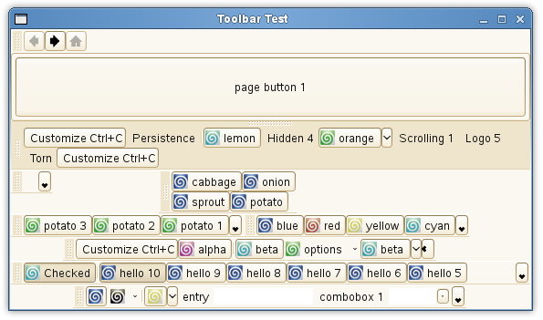
Here you can see various docked toolbars. The top toolbar is a dialogbar having various pages which can be navigated either by the arrows or the home button.
The toolbars can then be consolidated into one bar as shown below. This is used to group together units of similiar functionality for a more simplistic view of an applications usage. 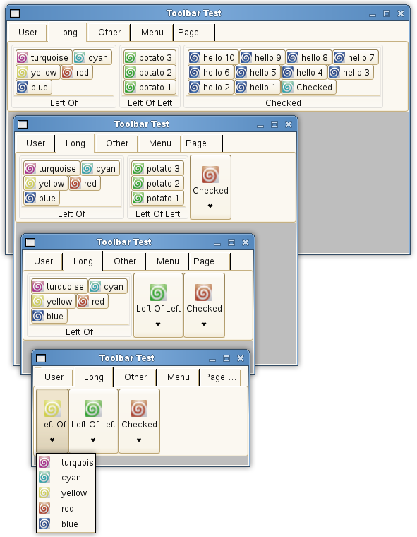
This shows a single consolidated bar with the main window at various sizes. Each toolbar can be assigned to a single group which maps to a single page. Each toolbar button on a page can then be refined into a sub-group, further refining and differentiating between units of functionality. When a sub-group becomes too small due to the main window size, the toolbarbuttons can be accessed via a sub-group menu button.
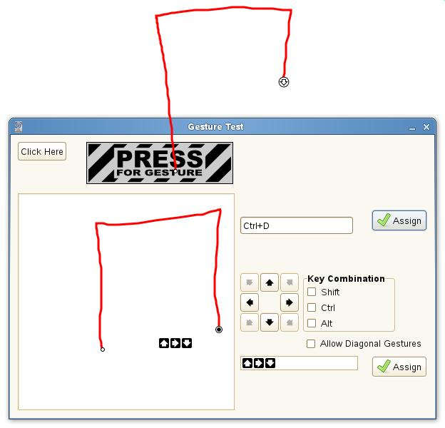
This shows the gesture test harness where you can assign a keyboard shortcut and a mouse gesture to a toolbarbutton. The recorded gesture displayed at the bottom of the dialog has been defined as Up/Right/Down and can be modified in the gesture edit box. An action is currently being performed by holding down the bouse button over the gesture hotspot and drawing the gesture.
|